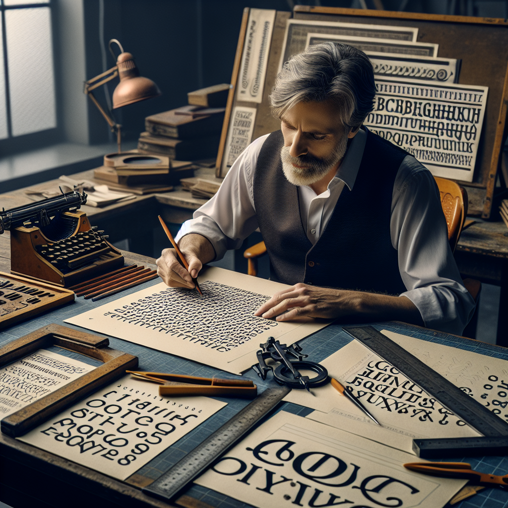

Have you ever heard of Vincent Connare? If you're anything like most people, you might not immediately recognize his name, but you’ve almost certainly encountered his work. Vincent Connare, the imaginative mind born in 1960 in Massachusetts, United States, played a pivotal role in the design of digital typography, creating one of the world’s most famous—and perhaps infamous—fonts: Comic Sans MS. This was at the heart of his career at Microsoft during the mid-1990s, a time when technology was exploding with innovation and creativity.
Vincent Connare studied at the New York Institute of Technology and refined his skills at the prestigious School of Visual Arts in New York City. It was this educational foundation that led him on a path of creativity and design. But let’s talk about Comic Sans, a font that sparked so much discussion and its fair share of controversy in the world of typography.
What Sparked the Creation of Comic Sans?
To understand Vincent Connare's impact, it's essential to know the story behind Comic Sans. In 1994, Connare was working with Microsoft and noticed user interface texts in the company’s software—and they seemed too formal and rigid for the intended audience of Microsoft Bob, a playful, family-oriented program. Connare, envisioning a font that mimicked the playful and informal look of comic book lettering, quickly created Comic Sans MS.
In a world where traditional fonts like Times New Roman and Helvetica dominated, Comic Sans brought a sense of whimsy and fun. Initially intended to bring a light-hearted touch to Microsoft Bob, Comic Sans quickly found its way into broader use. Its friendly aesthetic made it particularly popular in settings where soft communication was needed, and it is used worldwide in settings ranging from casual correspondence to early computer graphic design.
Impact: Love it or Hate it?
Since its inception, Comic Sans has been at the center of a polarized debate. For some, it’s a breath of fresh design air—a departure from the strict and structured fonts that came before it. Its approachable and easy-to-read style has won over educators and comic enthusiasts alike.
However, love is not universal: the font has also been met with intense criticism, often cited in discussions of bad design due to its ubiquity and informal style. Many designers feel Comic Sans lacks the professionalism and elegance needed in formal documents.
But here's where the magic of Vincent Connare shines. The debate itself highlights cultural and aesthetic dialogues, making Comic Sans an incredible case study in the subjective nature of design, differing tastes, and the impact of societal norms on aesthetic perceptions.
Beyond Comic Sans: Connare’s Continued Contributions
Vincent Connare’s work isn't confined to just one typeface. His career is an ongoing journey of exploration in digital design. Along with Comic Sans, Connare has contributed to the design of other significant fonts, including Trebuchet MS—a humanist sans-serif typeface designed with Microsoft—known for its suitability for web interfaces due to its clarity and functionality.
Notably, Connare’s work has extended beyond font design. He continued his career in design at various renowned digital design companies, contributing to projects that combine his expertise in typography, graphic design, and digital interfaces.
The Science Behind Typeface Design
Now, let's talk about the science of it all. Typeface design is not just about how letters look—it's about how they make us feel and how they function in our day-to-day interactions. The choice of typeface could impact readability, user experience, and accessibility, and it's this very intersection of art and science that makes typography so fascinating.
Vincent Connare exemplifies the harmony of technical skill and creative vision. He's demonstrated that fonts are foundational communicators and that their design needs to consider the context, the reading environment, and psychological reactions.
The Optimistic Future of Typography
Look around today, and you'll find that digital literacy is more crucial than ever. The innovative legacy of designers like Vincent Connare fuels an optimistic drive towards more inclusive and thoughtful design. Comic Sans and its story remind us of the joy in learning, experimenting, and taking bold risks that push the boundaries of tradition.
Whether you love or loathe a particular typeface, the craft interconnected with human emotion—from nostalgia to language understanding—is a testament to humanity’s boundless creativity and its ability to communicate beyond the limits of words.
Vincent Connare will forever be remembered in design history, not just for provoking thought and conversation, but for showing that even a humble font can make the world smile—or at least talk.